
The first thing you notice about every piece of text, be it print or online, is the font. While the font is seemingly just an aesthetic choice, font selection can say a lot about the content. Imagine reading an academic article written in a font like Comic Sans MS. At the same time, imagine reading a comic book where the word bubbles are filled in with a professional, serious font type like Times New Roman. Even though the words don’t change, the message is drastically different.
Arthur Asa Berger defines typography as, “the art of selecting and arranging type – or in broader terms – using type in various graphic designs to obtain particular effects. (Berger, 2012)”
To illustrate this effect, I will put two statements, containing all the same letters and punctuation, side by side, the only thing different about the two statements will the fonts.
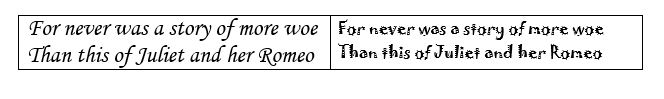
Clearly, the feel of this statement (taken from Act V of Romeo and Juliet) changes drastically just because of the font. Various fonts and typefaces carry a lot of meaning and character in the way that they look. It is remember this when choosing a font for certain projects; a font can completely change an intended message depending on how or where it is used.
In his book, Types of Typefaces: And how to recognize them, author J. Ben Lieberman said,
“Types, like all of printing, are tools in communication. Printing puts information into someone’s hands, influences him to feel or think a certain action. The typeface is the trigger part of that tool, so to speak, because it determines the way the message loos to the reader – pleasant, pretty, messy, painful or threatening – and this in turn affects the reader’s reaction to the printed message. (Lieberman, 1967)”
Taking this concept a step further, graphic designer Scott Prather said, “Typography is the vehicle through which we communicate tone of voice, age, gender, emotion—and it can be easily manipulated. Visual characteristics of the font do speak louder than words.”
I absolutely agree that visual characteristics, specifically font and typeface (typography), can speak much louder than words. When I teach my students in COMM 2110 Interpersonal Communications about mediated communication, we discuss the difference between receiving a text message from a parent that say, “call me,” versus a message that says, “CALL ME.” The feeling of the message is drastically different and the font never even changed. The visual characteristics of the message being in all caps made the text look much more urgent
References
Berger, A. A. (2012). Seeing is believing: An introduction to visual communication (4th ed.). Mountain View, CA: Mayfield Pub.
Lieberman, J. B. (1967). Types of Typefaces: And how to recognize them. New York: Sterling Publishing.
Prather, S. (2014, February 24). The Importance of Typography. Retrieved February 16, 2016, from https://vtldesign.com/brand-development/graphic-design/importance-typography-part-1-fonts-speak-louder-words/

One thought on “TYPOGRAPHY”